Anatomical Heart Art

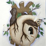
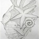
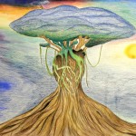
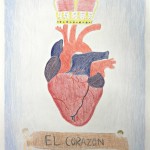
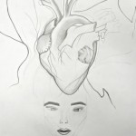
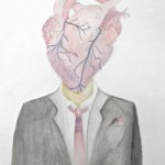
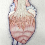
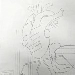
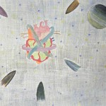
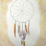
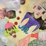
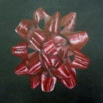
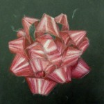
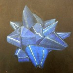
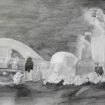
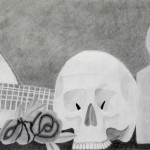
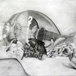
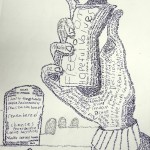
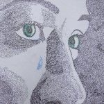
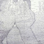
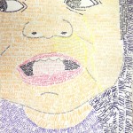
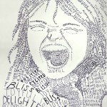
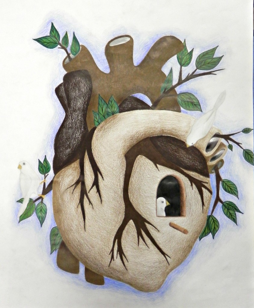
Art II students completed an assignment in which they studied and drew the human heart. I think to some people it seems a bit creepy, but the anatomical heart lends itself so well to illustrative pursuits…

We did gesture sketches of a model of human heart (borrowed from the Health Occupations teacher), studying it from different angles. Then students did several pages of sketches, in which they brainstormed different ways to morph the heart into something else. These are highly imaginative drawings. i had them experiment with different media, as they could choose which they wanted to work with. The results include a mixture of pen, charcoal, graphite, colored pencil, and soft pastel. This was a really engaging project, and my students enjoyed it and came up with some awesome interpretations of the heart.

Art II Mixed Media “Selfies”

Art II students recently explored the genre of the “selfie.” For this project we worked with four media in one piece — the student’s choice of: graphite, colored pencil, ink, art marker, chalk pastels, oil pastels, or watercolor. This gave students the opportunity to display their mastery of several media in one artwork. And it made for some lovely and unexpected results!

Art IV – Expressive Self-Portraits

Art IV students recently studied and completed Expressive Self-Portraits. I left these very open to interpretation with the request that they explore a variety of media. The result is an interesting variety of portraits that employ everything from ballpoint pen to old book pages.


Colored Pencil renderings of Christmas Bows…

This was just for a bit of seasonal fun, while tying in with our colored pencil study. In Art II we studied colored pencil use, and then tried this technique, creating the look of shiny highlights on black paper. Students also payed close attention to the form of the bows, using their observation skills to realistically capture their likeness. These Christmas bows turned out very nice!


Art II and the Still Life. . .

Recently in Art II we studied the still life. We discussed the whys and wherefores of the still life, and I got excited about something that I had previously found pretty boring. The still life is something that we have to do in Drawing class, but what’s it actually GOOD for? We talked about that. If I didn’t convince my students, I convinced myself! If nothing else, fortitude, surely. And of course, there’s the fact that the Dutch realists CHOSE to paint still lifes. I introduced students to “vanitas” — still lifes that take as their subject matter the fragility and brevity of life. “Vanitas” is latin; this genre take its name from the verse in Ecclesiastes — “Vanity of vanities, saith the preacher, vanity of vanities, all is vanity.” This type of still life was very symbolic, often containing objects which symbolized the transience of life — skulls, shells, stringed instruments, etc.

The vocabulary we studied as we prepared was as follows: balance, cast shadow, chiaroscuro, highlights, inanimate, movement, overlapping, proportion, still life, thumbnail sketch, vanitas, viewfinder 

We also discussed hierarchy, overlapping, and proportion in the still life, negative space in the still life, and how to set up a still life. All important!!

The students did wonderfully!! Here are some of the results, which represent hours of labor, and I hope to add more soon. I hope you enjoy! 

Chuck Close inspired portraits

 I’ve taught a similar assignment; however, this time we put a new twist on it. Portraits were broken down into tiny squares ala Chuck Close, then value was interpreted with black and white symbols or designs. This assignment required a lot of fortitude on the student’s part, but as you can see, there are some lovely results!

Observational Pumpkin drawing

Students once again drew gourds from observation, then worked them into a creative composition. Here are some of the great results!

A Different Perspective. . .

In Art I, we moved into the Italian Renaissance, really a vital and fascinating time in art. One of our discussions focused on Brunelleschi and his discovery of linear perspective, and the effect this had on art. Rather than focus on one-point perspective for a project, we worked with two-point perspective to create art galleries (a cute idea I saw in, I believe, School Arts magazine). This required lots of practice and lots of patience! Here are a few of the results. . . great job, and thanks to everyone for all your hard work!!

The Art of Micrography…Word!

Micrography is a lovely art form that dates back thousands of years in Hebrew culture. It can also be seen in Arabic culture. This form of art is much like stippling in its use of letters and words to create value and texture; however the use of text allows for a rich, unique interplay between text and the image. Featured in this post are a few of this year’s pieces; examples of prior years’ work can be found in the links for Art Galleries One and Two at the top of the page!

The inspiration for the lesson came from The Incredible Art Department’s website, which I have enjoyed and used often. The PowerPoint with directions can be found on the art resources link at the top of this page. Enjoy!! 🙂