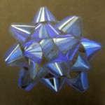
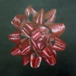
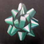
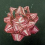
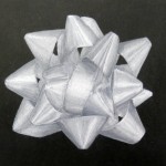
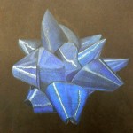
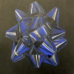
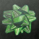
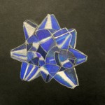
This was just for a bit of seasonal fun, while tying in with our colored pencil study. In Art II we studied colored pencil use, and then tried this technique, creating the look of shiny highlights on black paper. Students also payed close attention to the form of the bows, using their observation skills to realistically capture their likeness. These Christmas bows turned out very nice!
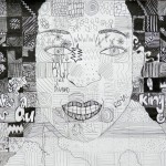
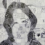
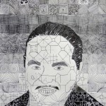
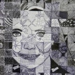
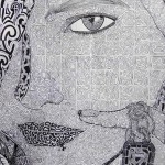
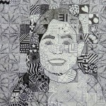
I’ve taught a similar assignment; however, this time we put a new twist on it. Portraits were broken down into tiny squares ala Chuck Close, then value was interpreted with black and white symbols or designs. This assignment required a lot of fortitude on the student’s part, but as you can see, there are some lovely results!
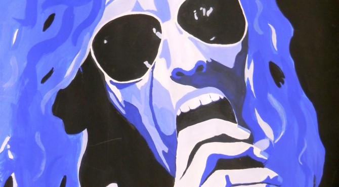
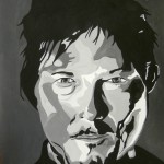
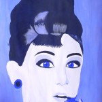
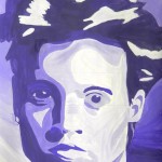
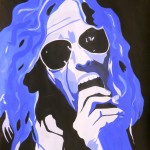
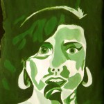
Advanced Painting students recently finished these fantastic celebrity portraits! This lesson focuses on a monochromatic color scheme, and the Pop Art movement of the 1950’s and 60’s – particularly the graphic art of Andy Warhol, Roy Lichtenstein and the like. I closely followed Kim Bartel’s great lesson on The Incredible Art Department’s website. After a couple of years doing this project, I’ve found that a few things factor into students’ success:
Students should complete a painted grayscale and a monochromatic value scale. I tell them they need to experiment with the color they are planning on using for their portrait because mixing it with black or white will alter it considerably, especially black.
after students have worked with mixing colors and creating values and are comfortable, they should begin their portrait. it’s best to work from a black and white photo — if they don’t have this, a grayscale copy should be made. We generally tried to crop photos to about 5″ x 7″. We were working on 14″ x 21″ paper, so this worked out almost perfectly. Students simply gridded up from 1″ boxes to 3″ boxes.
Students first outlined all areas of value in their photo. I worked with them quite a bit on this, getting them to “see” areas of value rather than simply a nose or an eye, etc. Sometimes I would suggest turning the picture upside down so they would be freed from their conception of what they were drawing. Once they began to think of these faces as just different shapes of value, the project began to click.
The next step was to grid this up onto their large paper. They started with a light outline drawing and then laid in all the amoebic looking shapes for the different values. They numbered these from 1-5 on their photo (1 – lightest value; 5 – darkest value
by Katee G.
by Shelby B.
by Cortney M.
by Hannah C.
by Amber R.
) and then put the corresponding numbers on their large drawing. ready to paint.
Now the fun part! Each student needed simply one color of paint, plus black and white. I had them paint a 5-box value scale to correspond with their numbered portraits. This way they had a reference as they painted, and for each new class period.
It was neat to observe how, even in the context of this uniform assignment, each student had his/her unique style and technique. It was a lot of fun, and produced some awesome results!! 🙂
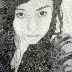
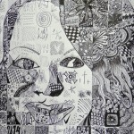
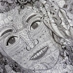
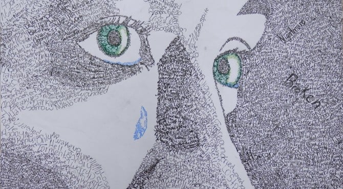
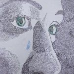
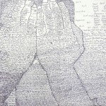
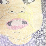
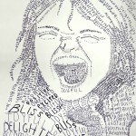
Micrography is a lovely art form that dates back thousands of years in Hebrew culture. It can also be seen in Arabic culture. This form of art is much like stippling in its use of letters and words to create value and texture; however the use of text allows for a rich, unique interplay between text and the image. Featured in this post are a few of this year’s pieces; examples of prior years’ work can be found in the links for Art Galleries One and Two at the top of the page!
The inspiration for the lesson came from The Incredible Art Department’s website, which I have enjoyed and used often. The PowerPoint with directions can be found on the art resources link at the top of this page. Enjoy!! 🙂
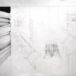
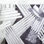
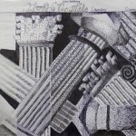
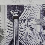
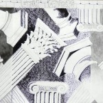
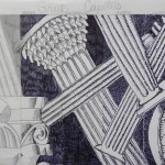
My Art I students created these brilliant compositions after LOTS of hard work…I totally admire their dedication, patience, and skill. We reviewed the element of VALUE which involved creating value scales using different methods of shading.After studying ancient Greek art and architecture, we focused on the three types of capitals for our artwork: Doric, Ionic, and Corinthian. Guidelines for student compositions:
12″x15″ paper
Draw lightly!!
Must include at least two of each type of capital
Principles of art to consider-balance, variety, movement
Provide variety by-some smaller, some larger capitals; coming into composition from different directions; negative space use
Must use overlapping
Divide paper into 3″ columns with a 1″ strip at top (for title)
Use a different type of shading in each column while retaining the same value
Use the same light source throughout
Shading with a light source was NOT easy…students had lots of small details in their drawings, and had to really think about which plane the light would be hitting for each little thing.So…great job!! 😀