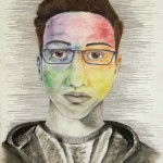
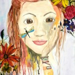
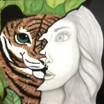
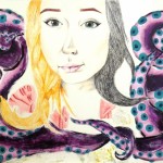
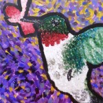
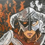
Art IV students recently studied and completed Expressive Self-Portraits. I left these very open to interpretation with the request that they explore a variety of media. The result is an interesting variety of portraits that employ everything from ballpoint pen to old book pages.
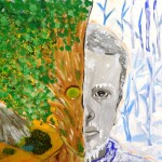
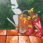
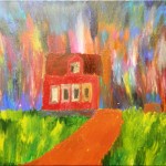
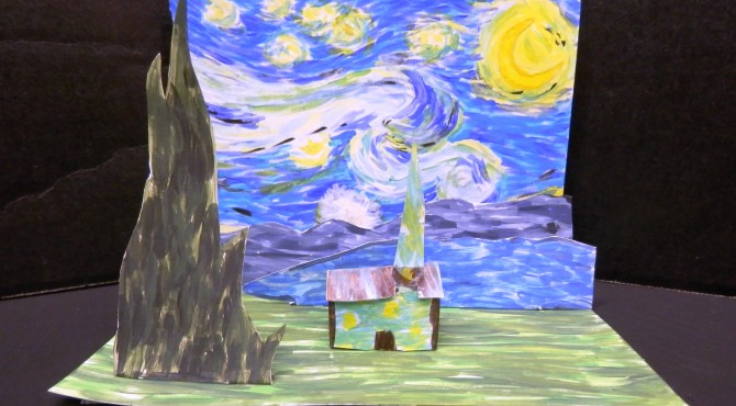
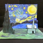
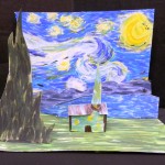
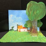
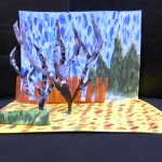
Summer is here! and I will have to strive to catch up on posting the last of this year’s artwork. Advanced Painting students, after studying van Gogh’s painting techniques, attempted their own post-impressionist masterpiece. Below are a smattering of the results. Enjoy!
P.S. The accompanying PowerPoint for this lesson, “Starry, Starry Night,” is posted on the Resources page. And if it’s not, leave a comment; I’ll get it on there when I’m not so sleepy!! 😉
I found these two small paintings hanging on a narrow wall upstairs in my grandparents’ bedroom a few months ago. I saw them and thought, those look familiar; where did they come from…? and realized I had painted them a long time ago, between 20 and 25 years ago I’d say. Watercolors…not really my thing, I think (my mother’s thing, more). But I sort of like them. They’re just simple, and quiet, dark, calm.
Advanced Painting students are studying the life and art of Vincent van Gogh. As a prelude to a larger van Gogh – inspired painting, they created these small interpretations of Starry Night. Some students chose to paint a different artwork, which was really neat. These landscapes turned out beautifully, and were lots of fun!
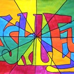
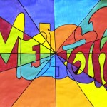
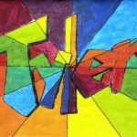
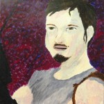
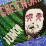
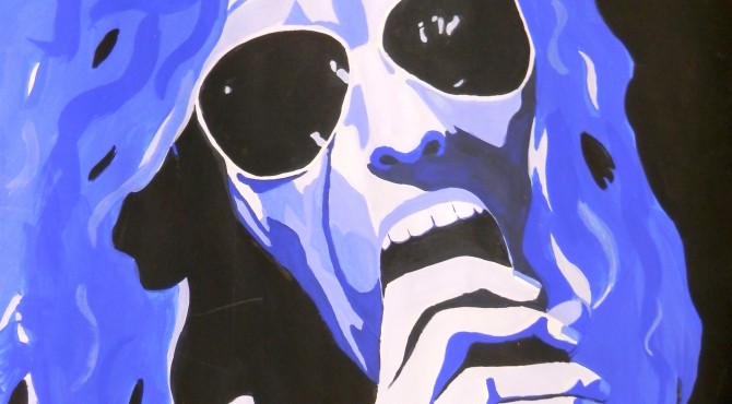
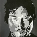
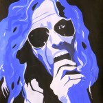
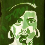
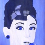
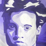
Advanced Painting students recently finished these fantastic celebrity portraits! This lesson focuses on a monochromatic color scheme, and the Pop Art movement of the 1950’s and 60’s – particularly the graphic art of Andy Warhol, Roy Lichtenstein and the like. I closely followed Kim Bartel’s great lesson on The Incredible Art Department’s website. After a couple of years doing this project, I’ve found that a few things factor into students’ success:
Students should complete a painted grayscale and a monochromatic value scale. I tell them they need to experiment with the color they are planning on using for their portrait because mixing it with black or white will alter it considerably, especially black.
after students have worked with mixing colors and creating values and are comfortable, they should begin their portrait. it’s best to work from a black and white photo — if they don’t have this, a grayscale copy should be made. We generally tried to crop photos to about 5″ x 7″. We were working on 14″ x 21″ paper, so this worked out almost perfectly. Students simply gridded up from 1″ boxes to 3″ boxes.
Students first outlined all areas of value in their photo. I worked with them quite a bit on this, getting them to “see” areas of value rather than simply a nose or an eye, etc. Sometimes I would suggest turning the picture upside down so they would be freed from their conception of what they were drawing. Once they began to think of these faces as just different shapes of value, the project began to click.
The next step was to grid this up onto their large paper. They started with a light outline drawing and then laid in all the amoebic looking shapes for the different values. They numbered these from 1-5 on their photo (1 – lightest value; 5 – darkest value
by Katee G.
by Hannah C.
by Amber R.
by Shelby B.
by Cortney M.
) and then put the corresponding numbers on their large drawing. ready to paint.
Now the fun part! Each student needed simply one color of paint, plus black and white. I had them paint a 5-box value scale to correspond with their numbered portraits. This way they had a reference as they painted, and for each new class period.
It was neat to observe how, even in the context of this uniform assignment, each student had his/her unique style and technique. It was a lot of fun, and produced some awesome results!! 🙂
This is a lovely piece Jessica Vincent did on an approximate 8 ft. panel the year before she graduated (2011).Ashley Smith painted this delightful celestial scene on a large wooden sign before she graduated this past May (2012).I had a tri-panel screen that I needed to liven up; Ashley Barrios painted this cute scene from Nightmare Before Christmas!