I’ve been talking about this with my students in our ongoing discussions of Impressionism and post-Impressionism (i.e. van Gogh). Here’s the graphic:

I’ve been talking about this with my students in our ongoing discussions of Impressionism and post-Impressionism (i.e. van Gogh). Here’s the graphic:
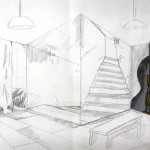
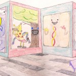
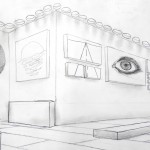
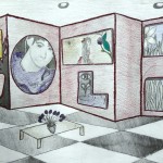
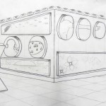
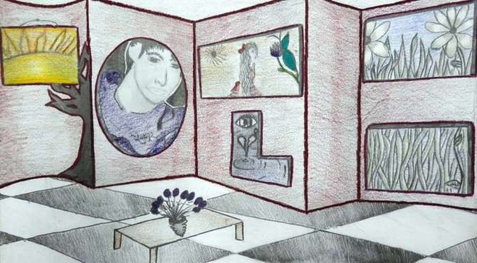
In Art I, we moved into the Italian Renaissance, really a vital and fascinating time in art. One of our discussions focused on Brunelleschi and his discovery of linear perspective, and the effect this had on art. Rather than focus on one-point perspective for a project, we worked with two-point perspective to create art galleries (a cute idea I saw in, I believe, School Arts magazine). This required lots of practice and lots of patience! Here are a few of the results. . . great job, and thanks to everyone for all your hard work!!

I found these two small paintings hanging on a narrow wall upstairs in my grandparents’ bedroom a few months ago. I saw them and thought, those look familiar; where did they come from…? and realized I had painted them a long time ago, between 20 and 25 years ago I’d say. Watercolors…not really my thing, I think (my mother’s thing, more). But I sort of like them. They’re just simple, and quiet, dark, calm.

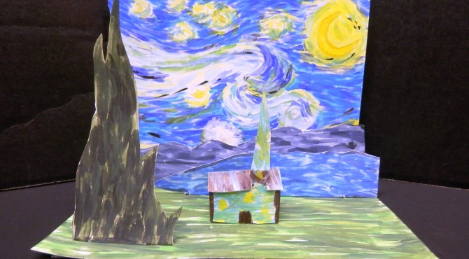
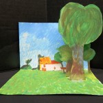
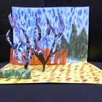
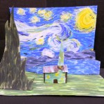
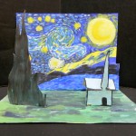
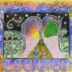
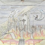
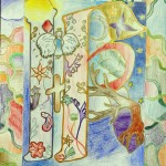
Advanced Painting students are studying the life and art of Vincent van Gogh. As a prelude to a larger van Gogh – inspired painting, they created these small interpretations of Starry Night. Some students chose to paint a different artwork, which was really neat. These landscapes turned out beautifully, and were lots of fun!

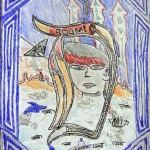
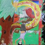
To This Day Project is a project based on a spoken word poem written by Shane Koyczan called “To This Day”, to further explore the profound and lasting impact that bullying can have on an individual.
This video, based on Shane Koyczan’s spoken word poem, not only has a great message but is also amazing graphically.
Do watch.
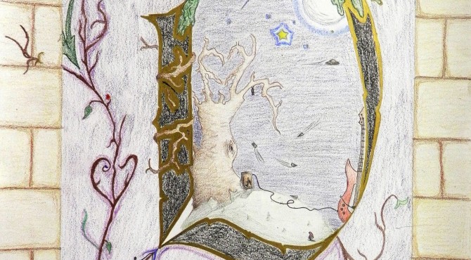
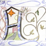
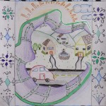
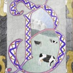
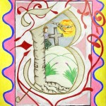
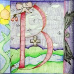
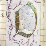
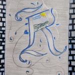
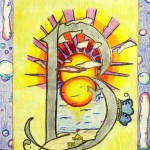
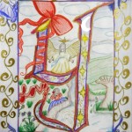
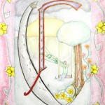
During their study of the Medieval period, Art I students had a comprehensive lesson on illuminated manuscripts. We began with the 7th and 8th c. insular manuscripts of the Celts and Anglo-Saxons and continued through the texts of the Gothic Age (1500s).
Students looked at the entire process of creating illuminated manuscripts and how they functioned in Medieval society, as well as many examples, including modern ones.
Drawing inspiration from sources such as the Romanesque period Winchester Bible, Books of Hours, and other manuscripts, students produced some lovely results.
We focused on producing an “historiated initial.” Criteria included the following:
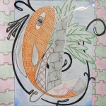
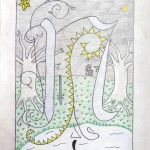
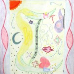
Students were to create an artwork that expressed their interests or personalities. In order to help them understand how to put a miniature inside their letter, we looked at lots of examples, and I explained that their picture should be a narrative, or tell a story.
The PowerPoint I created to go with this lesson can be found on the Art Resources page.
I hope you enjoy these beautiful Illuminated Letters. . . they did an amazing job! 🙂


In Art I, we are studying art of the Italian High Renaissance. We’ve discussed how da Vinci’s Mona Lisa,, besides being the most famous painting in the world,, is also among the most parodied.
Art I students, here’s your extra-credit opportunity! In the comment box below, post your favorite Mona Lisa parody. Give the title and artist, or the website, so that I can look it up. To receive credit you must explain why this is your favorite, because there are so many to choose from! The caveat: you cannot post one that has already been posted.
Anyone is welcome to post. . . extra credit notwithstanding!!
Here are a few favorites of mine…


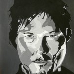
Advanced Painting students recently finished these fantastic celebrity portraits! This lesson focuses on a monochromatic color scheme, and the Pop Art movement of the 1950’s and 60’s – particularly the graphic art of Andy Warhol, Roy Lichtenstein and the like. I closely followed Kim Bartel’s great lesson on The Incredible Art Department’s website. After a couple of years doing this project, I’ve found that a few things factor into students’ success: